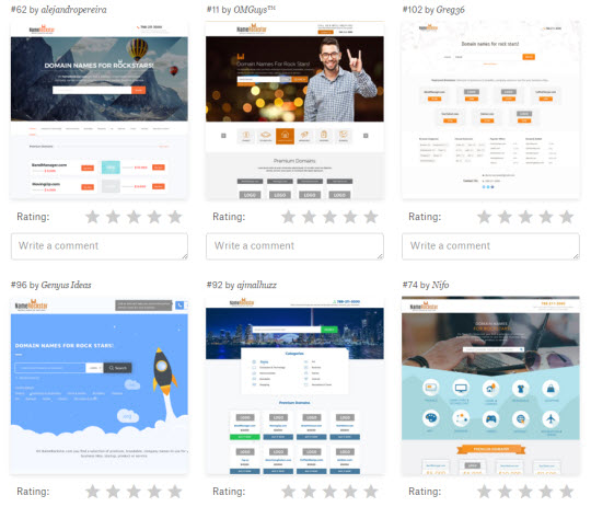
Efty is doing a massive redesign of its custom domain name marketplace and wants you to pick the best design.
The custom marketplace is one of the features in Efty for which they receive a constant stream of request, ideas and suggestions.
Efty offers a customizable domain name marketplace and enables domain name investors to generate leads from end-users with 0% commissions.
A massive redesign of the custom marketplace is currently in the works. Some of the new changes include the ability to specify your own color scheme, pick a background image from a gallery of high quality photos and last but not least the option to showcase your domains with logos.
Efty decided to tap into the design community over at 99Designs and hold a contest for a fresh new design that is professional, responsive and with great UX.

Efty narrowed down 100+ submissions to eight designs and now they need your help to decide on the very best. Head over to https://99designs.hk/web-design/vote-mwr6yw and leave your rating and comments. Each design comes with a mobile-friendly version. I personally like “#95 by Suegeer”.
 OnlineDomain.com Domain Name News & Opinions


 OnlineDomain.com - © Copyright 2012-2026 - All Rights Reserved
Slightly confused, is this a design for the landing page of a domain or for their home page? I did a lot of design changes like this myself when starting my business. My advice to Efty is to pick something extremely simple and stick to it and then build off it, improve it, etc.
Out of those designs the first one is best, but then again it mostly reminds me of DNS landing pages for whatever reason. Maybe the balloons or something. It also says bandmanager.com and I’m sure I seen that on DNS. So if the designers had DNS as an inspirational design, then that’s probably why it looks like it.
Hi Matt, it’s Doron here, one of the co-founders. The redesign is for the customizable marketplace that our users can create with our software for their own portfolio of names.
The current marketplace template looks like this: http://www.namerockstar.com (this is my personal personal) and was in need of a make over. The designs you see now can be customized by each user with their own logo, color scheme, background image etc.
BandManager.com is one of the domains from my own portfolio and just like NameRockstar.com, it is being used as an example domain in the design contest. The BandManager.com domain name always had a Efty For-Sale landing page up. We used it a lot in the past for showing examples of our different landing pages so that might explain why the domain looks familiar to you.
Please don’t hesitate to reach out if you have any questions, comments or ideas to share. I can be reached at doron@efty.com
Ah that makes sense now. Thanks for explaining. Good luck on the changes!