Efty just released 3 ugly landing pages for some domain names, mainly the ultra-premium names in your portfolio, you just wish to HODL until that perfect end-user, with the matching budget, comes knocking!
“Efty is here to help you play hard to get, at scale. We worked hard (well, kinda) on creating three landing pages that will take any visitor on your domains back to the days of the dial-up internet, flashy text art, pixelated graphics, and broken HTML.”
“These templates will give visitors the impression they have stumbled upon an abandoned website but, in true Efty fashion, there still is an easy way to contact the “site owner”. And when visitors do, Efty will capture not only their email, phone number and message, but also the IP address so you have all the necessary information to do some research and due diligence on the lead before reaching back out.”
Readme.txt
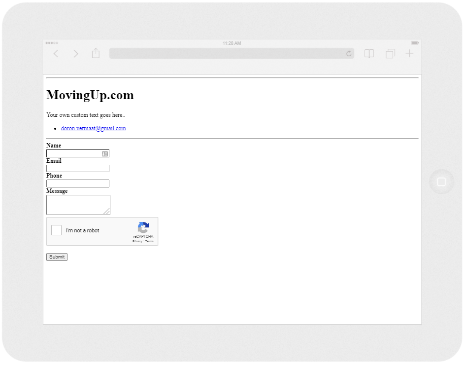
“This landing pages will remind visitors of a website that is no longer properly configured as the design is inspired by a Nginx 404 not found error. It will show the domain name, a custom text (that you can write within the Profile box of the domain) and your email address (as taken from the Account > Profile page within your account) in a simple plain text file format, like a Readme.txt. The page also hosts a contact form that feeds straight back into your inquiry funnel.”
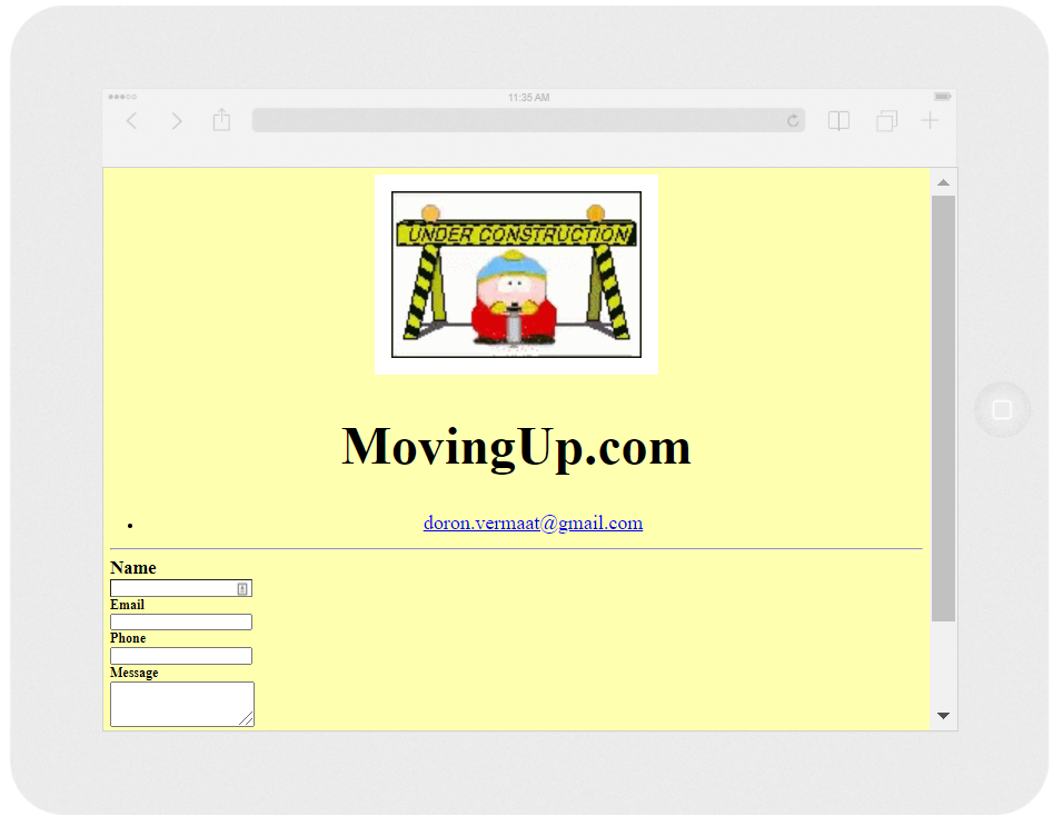
“We all remember the incredible lame, Under Construction signs that used to plaster the web in the early 2000s. At Efty, we want no-one to ever forget so we worked with the world’s finest designers to recreate the most amazing animated gifs that will rotate on this landing page (hit refresh and you will see another gif).”
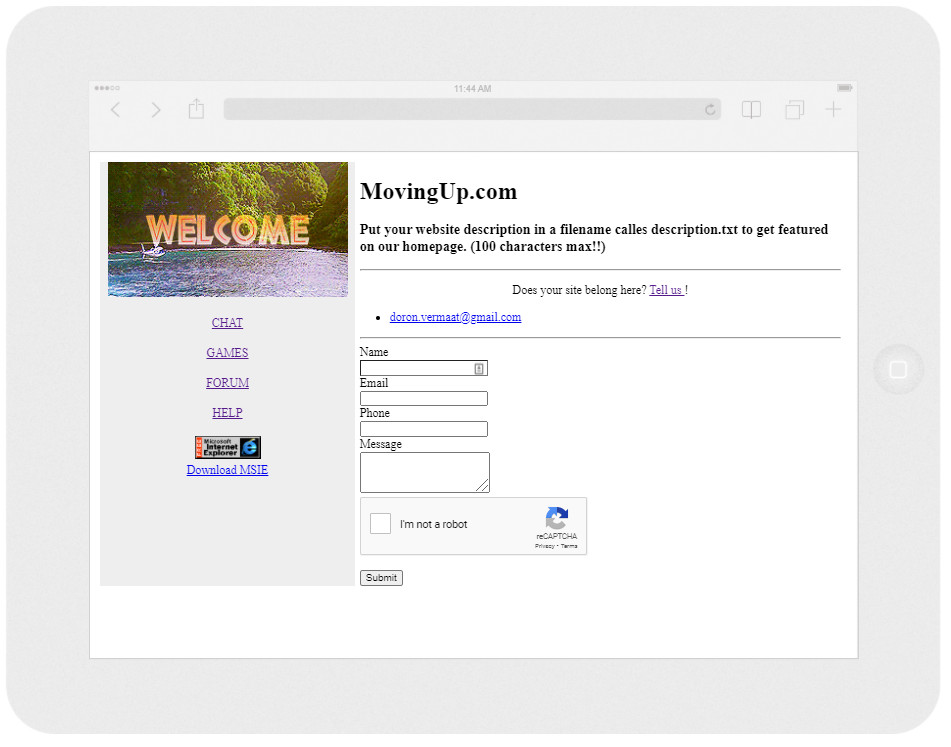
“We’re saving the best for last. Who remembers the magical days of Geocities? This Yahoo! owned web-hosting service was a paragon of this early internet era that allowed users to create and publish websites for free. For many folks, this is where their internet journey started and they will feel this nostalgia when landing on your domain. Just like the Readme.txt landing page, this theme will feature your email address and a contact form, alongside a majestic Jurassic Park Welcome banner.”
 Check these templates live at Eftylent.com
 OnlineDomain.com Domain Name News & Opinions


 OnlineDomain.com - © Copyright 2012-2026 - All Rights Reserved
Truth be told. This will make it harder for domains to be purchased. Landing pages should be concise, straight to the point and have a clear message. Things need to be simplified and not complicated. “Complexity is your enemy. Any fool can make something complicated. It’s hard to keep things simple.” – Richard Branson
If only one could tell how you really feel about them…