GoDaddy Inc. (NYSE: GDDY) today revealed its new logo that according to GoDaddy “captures the company’s unique ability to enable, connect and champion millions of people around the world who are making their own way as entrepreneurs.”
GoDaddy’s new logo, called “the GO,” is “a joyful reflection of how GoDaddy celebrates everyday entrepreneurs from all walks of life, backgrounds and cultures, and how GoDaddy brings together humanity and technology to serve them like no other.” 
Here are the 2 color variations of the new “The Go” logo from GoDaddy:

 “The GoDaddy brand stands for inclusive entrepreneurship and helping anyone who wants to change how they work and live for the better by bringing their ideas to life online,” said GoDaddy Chief Marketing Officer Fara Howard. “Regardless of where an entrepreneur is at in their journey, from taking the first step online to shipping a first order to conducting a new marketing campaign, GoDaddy is here to guide them along the way with advice, support and all of the tools necessary to succeed.”
“The GO says to our community that they can stand on their own two feet and go do what they love,” said GoDaddy Chief Brand Officer Cameron Scott. “When entrepreneurs see the GO, they know they have someone standing in their corner, championing their every step along the way, to turn their ideas into reality.”
“Core to how GoDaddy accomplishes this is its unique ability to combine seamlessly intuitive products with unmatched personable guidance that together enable entrepreneurs to make their dreams a reality online. The GO complements GoDaddy’s drive to unlock opportunities for its customers through this combination of technology and humanity:
- GoDaddy has more than 6,000 GoDaddy Guides around the world who have nearly 2 million conversations every month with customers. GoDaddy’s guidance empowers its customers throughout their journey to name, create, grow and manage their ventures, providing a helping hand and support along the way.
- GoDaddy is innovating new tools to help entrepreneurs flourish online, most notably the recent introduction of Websites + Marketing, pairing an easy-to-use website builder with a suite of marketing tools for small businesses, and the launch of a platform-wide update to its GoDaddy WordPress Hosting offering that makes it easier than ever to create customizable sites with increased flexibility.”
For more information about the GoDaddy brand, the story of the GO and digital assets, please visit https://godaddy.design/the-go/.
 OnlineDomain.com Domain Name News & Opinions


 OnlineDomain.com - © Copyright 2012-2026 - All Rights Reserved
How long did that take to make, 5 minutes on Etch A Sketch?!
I am just saying what others are thinking too.
Pretty good actually, certainly better than before.
I guess it represents a heart to show godaddy cares, new ceo, making changes, logos are like this, they seem simple when done, but can be quite complex when creating.
Great idea.
Great company.
That said, closed loop visually suggests the opposite of “inclusive”. A slight break at the top of the G would make it easier to “see” and convey ” open ” and ” inclusive ” better.
It’s great to see the use of .design however would like to see more inclusion of New G’s
in the all “inclusive” new persona.
Not once have I ever seen anything other than a crappy .com suggested if what one searches for isn’t available. Again the opposite of “inclusive”
I don’t support NamesCon. it’s not all about .com going forward. All walks of life backgrounds cultures not represented very well
When actions actually demonstrate “inclusive” is when the word has meaning.
The core principal and reason for branding,
“differentiation” Nothing new here.
Don’t see the “drive” to unlock new opportunity.
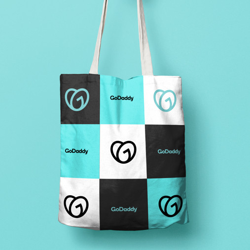
Sorry but the bag looks like someting my grandmother would want not future entrepreneurs from all walks of life.
I hope GoDaddy finds this helpfulI. Would like to see them break out of the status quo stand on their own two feet, take the leap and become a innovation leader again.
The definition of entrepreneurship.
Cheers
Its Tiffany Blue color, same color as Tiffany & Co trademark color Tiffany Blue
I think this logo looks better than their previous logo. Very nice.