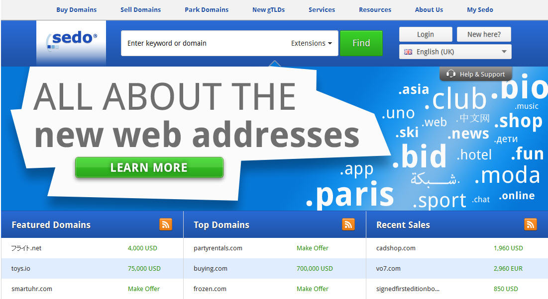
 Sedo announced today that it has equipped its homepage with a revamped design.
“Our goal with this new look is to put buyers first and to make it even easier for both existing and new clients to find the right domains. We have made great strides and have simplified how new users access the trading platform. For them, utilizing the secondary domain marketplace is now easier than ever!”
Here are a few of the introduced changes:
- From any page on our site buyers will get quicker search results of desired domains and keywords with prominently placed search bar s. The ease of finding a domain is now more visible allowing our domain inventory to be front and center for buyers.
- For many visitors the “domain purchase” topic is still uncharted territory. Therefore, we counter this by directly addressing the three core questions most frequently asked by users. With this buyers discover that making domain purchases is as easy as doing any other shopping on the Internet.
- For initial and direct insight into current market activity, the tables: “Featured Domains”, “Top Domains” and “Recent Sales” are clearly and prominently displayed and will guide the user on the status of the present market.
“The new Sedo website concept and revamped design are the first steps in the foundation for a planned series of optimization activities. In the coming weeks and months we will be working on implementing improved user-friendly guidance through the entire Sedo website and its services.”
 OnlineDomain.com Domain Name News & Opinions


 OnlineDomain.com - © Copyright 2012-2026 - All Rights Reserved