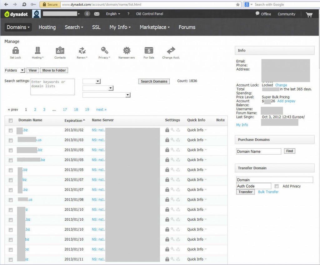
Today, I logged into my account at Dynadot only to find a new control panel awaiting. That was a nice surprise to mark the 10th anniversary of one of my favorite registrars.
The new control panel has a better and more appealing user interface and functionality. The top menus have been revamped completely and now take a lot less space of the screen and give more space to the domain list below. The old 2 top menus have been replaced by a drop down menu. Managing your domains is done using elegant graphic icons (with drop down menus as well) that have replaced the old ugly buttons.
Besides the usual domain list, you can find a summary of your account details on the right hand side along with the options to purchase or transfer domains.

The old control panel is still available if you prefer it, using a link at the top of the page that says: “Old Control Panel”.
The transition to the new control panel is not complete as the shopping cart and the checkout process are still handled by the old interface and still have a couple of steps too many. In this review, I believe this is my only complaint with Dynadot. 🙂
 OnlineDomain.com Domain Name News & Opinions


 OnlineDomain.com - © Copyright 2012-2026 - All Rights Reserved